Posts

Cool page load transition

Image
How did this happen? 1. Script executes at starting of page load, divides screen size into 16 and 9. 2. 16 blocks horizontal and 9 blocks vertical is generated 3. Each block is given respective height width according to screen size. 4. Blocks are give a transition delay in a for loop along with an increment. 5. The wavy effect is given by using custom bezier curves for transition Add this script and css to the top of your webpage for this cool transition.!!!! Visit my profile website to witness this effect in action jonesvinothjoseph.blogspot.in

Pure CSS responsive Navbar

Image
This is another element of web page, which normally requires some script. This is somewhat related to my last post " Pure CSS Collpasible Accordion ", where I used a 'radio button' to manipulate the collpase and expanding of panels. Same thing here, this time its a 'checkbox' and a 'label' which collapses and expands the navbar when screen size less than 600. Note: Refer to the previous post to see how 'radio button' and 'label' work together. A big nav [Desktop View] A collapsed nav [Mobile view] Full HTML + CSS code

Pure CSS Collpasible Accordion

Image
HTML accordion control made purely out of css. No JS !! Any accordion would definitely need some JS function The following accordion uses input type="radio" and the ' :checked + div ' CSS selector to collapse and expand content. Example selector: input[type="radio"]:checked + div{     /*expand this*/     height:200px; } The collapse code input[type="radio"]:not(:checked) + div{     /*collapse this*/     height:0px; } How does it work? The title of each collapsible is a label which has the attribute for="collapsible-1" to trigger the radio button collapsible-1 . Clicking the label checks the corresponding radio button. The div following the radio button is expanded as per the CSS code shown above [this collapses the rest of the div s automatically because its a radio button group, selecting one un-selects the other radio by default]. A radio button is added say collapse-all which is isolated and is not associa

CSS Monkey

Image
A monkey from pure CSS code. Made only from circles and ellipses, technically only ellipses. Eyes, ears, face and mouth are obvious ellipses. The smile and hair are ellipses too, a transparent one wit only one side border, and rotated in such a way that it looks like a strand of hair. Even the monkey's smile, is a ellipse covering the whole face, but its transparent and has a bottom-border  of few pixels which makes it look look like a smile. The complete CSS and the monkey:  See the Pen CSS Monkey by Jones Vinoth Joseph ( @jo_Geek ) on CodePen .

CSS Ghost - not really!

Image
Done using basic shapes. Circle , Rectangle , Semi-circle , Triangles See the Pen CSS Ghost by Jones Vinoth Joseph ( @jo_Geek ) on CodePen .

Split em up!

Image
Inspired from a Pen on codepen which had the same functionality but with too much of JS to calculate and split the blocks into further pieces! I took advantage of CSS along with jQuery to make the same PEN  in a few lines. Code and the splitting effect! Click as many squares as you can.. See the Pen Break the block! by Jones Vinoth Joseph ( @jo_Geek ) on CodePen . P.S. The original PEN  used images. Being a lazy bone i just put background colors instead of images..

CSS Kitty

Image
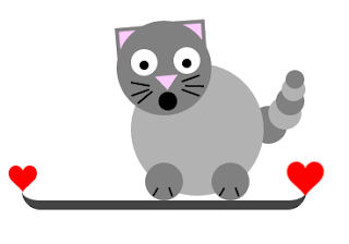
Kitty with basic shapes in pure CSS. Well don't ask me why it is staring at you with mouth open!! I am no artist.. just put few circles and lines here and there to make it look like a cat!! Here is the code.. and the cat!! See the Pen CSS Kitty by Jones Vinoth Joseph ( @jo_Geek ) on CodePen .